Monday, April 30, 2012
Sunday, April 29, 2012
En Dashes, Em Dashes, and Hyphens--Oh my!
Just seems en dashes, em dashes, and hyphens can't simply be used correctly. The above are (or at least should be) obvious examples of incorrect usage. The following should help clarify why...
Hyphens: the shortest of the three. Used mostly for connecting compound words. Nowadays, however, there has been a distinction. Words like twentieth-century, which include an adjective followed by a noun use a hyphen, while phrases like mother-daughter relationship, which includes two consecutive nouns, would instead use an en dash.
More on En Dashes: Other than the above usage for en dashes, they are more widely used for indicating closed ranges of values such as dates and page numbers. Examples: Class will meet from 3:30-5:00, as well as Tonight's assignment is to read pages 33-38. It is important to note that there is NO SPACE between the values and the en dash.
Em Dashes: the longest of the three. Commonly used for interruptions within sentences and to cut off an ending. According to Susie--who surely only knows these things because she the biggest teacher's pet--there is a pop quiz tomorrow.
So, to sum up...
Wednesday, April 25, 2012
Monday, April 23, 2012
Friday, April 20, 2012
Stretching Text: Never Appropriate
Find what you think is your perfect typeface, but it just isn't quite tall enough? Or it doesn't quite fit across the length of your picture? Stretching (or scrunching) text is never appropriate and ends up looking very unprofessional.
The text will become reminiscent of what those in their late teens & early 20s will recognize from their school days: Microsoft WordArt.
If you find yourself in this situation, find another appropriate typeface or choose a typeface with a large family, including a narrow or wide setting.
Sunday, April 15, 2012
Bad Kerning: It Can Happen to Anyone
Awkward spacing between letters--it happens. Sometimes poor attention to detail, sometimes automatically in a font's settings.
But never fear! There is a way to fix your bad kerning & make your text more pleasing to the eye. Just a few clicks of the mouse can take a word from drab to fab!
Monday, April 9, 2012
Menu Project: Concept & Mood Board
For the restaurant/menu project, I am created an eccentric little establishment named AK47 Delicatessen and Cafe. It would be an urban-based establishment offering an eclectic array of healthy and organic foods as well as (obviously) coffee, with a stress on fair trade and eco-responsibility. It would also serve the creative community as a way to promote rising artists, musicians, & the like.
Although this is not ethnic per se, this sort of eatery would attract a group of people DJ would like to refer to as "hipsters," though I argue it is fitting for anyone in the mood for a good cup of joe or a delectable bowl of frozen yogurt in a warm and vibrant atmosphere, while benefiting a fair trade initiative and local farms at the same time. The term "hipster" can lead people to think of cold, self-righteous creatives, but I want this cafe to be a warm, friendly, small city-style establishment where creative and analytical minds alike can gather to discuss, read, write, or just enjoy their coffee.
Before I make the history of this cafe, the name AK47 is actually something I made up in high school. It comes from my first 2 initials A & K. It was originally used for a fictional design firm I created in high school called AK47 Print & Press, which in & of itself seemed to be a bit of a contradiction between the very modern-sounding "AK47" & nostalgic "Print & Press," but I really liked it. Of course my story of the cafe will be much more interesting, I hope.
My mood board exhibits several photos of the exteriors and interiors of different small urban cafes, as well as just a few food options including cappuccino, frozen yogurt, grape leaves (a personal favorite), and paninis. One small thing I did want to stress is the orange coffee cup in the middle of the board, which is compostable; this theme of eco-responsibility I wanted to connect into the utensils, napkins, etc., maybe even the take-out box. To the side, the color scheme provided evokes warmth with numerous browns & oranges & adds a dash of contrast with green accents.
Friday, April 6, 2012
Chain Restaurants use Smart Quotes
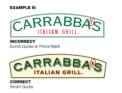
I originally went out this week after finding the following image to show that some major chain restaurants are still using dumb quotes.
The top logo is Carrabba's old logo, the bottom their revamped current logo. It seems they learned their lesson.
But turns out far & wide, restaurants are being smart with their quotes. Some more examples of chain restaurants format their apostrophes correctly include...
Both of Chili's logos utilize smart quotes, though I feel the bottom works better visually.
Even Wendy's old-fashioned signage is using apostrophes correctly.
Subscribe to:
Comments (Atom)


