Typography at MU
Friday, May 4, 2012
Monday, April 30, 2012
Sunday, April 29, 2012
En Dashes, Em Dashes, and Hyphens--Oh my!
Just seems en dashes, em dashes, and hyphens can't simply be used correctly. The above are (or at least should be) obvious examples of incorrect usage. The following should help clarify why...
Hyphens: the shortest of the three. Used mostly for connecting compound words. Nowadays, however, there has been a distinction. Words like twentieth-century, which include an adjective followed by a noun use a hyphen, while phrases like mother-daughter relationship, which includes two consecutive nouns, would instead use an en dash.
More on En Dashes: Other than the above usage for en dashes, they are more widely used for indicating closed ranges of values such as dates and page numbers. Examples: Class will meet from 3:30-5:00, as well as Tonight's assignment is to read pages 33-38. It is important to note that there is NO SPACE between the values and the en dash.
Em Dashes: the longest of the three. Commonly used for interruptions within sentences and to cut off an ending. According to Susie--who surely only knows these things because she the biggest teacher's pet--there is a pop quiz tomorrow.
So, to sum up...
Wednesday, April 25, 2012
Monday, April 23, 2012
Friday, April 20, 2012
Stretching Text: Never Appropriate
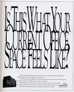
Find what you think is your perfect typeface, but it just isn't quite tall enough? Or it doesn't quite fit across the length of your picture? Stretching (or scrunching) text is never appropriate and ends up looking very unprofessional.
The text will become reminiscent of what those in their late teens & early 20s will recognize from their school days: Microsoft WordArt.
If you find yourself in this situation, find another appropriate typeface or choose a typeface with a large family, including a narrow or wide setting.
Sunday, April 15, 2012
Bad Kerning: It Can Happen to Anyone
Awkward spacing between letters--it happens. Sometimes poor attention to detail, sometimes automatically in a font's settings.
But never fear! There is a way to fix your bad kerning & make your text more pleasing to the eye. Just a few clicks of the mouse can take a word from drab to fab!
Subscribe to:
Comments (Atom)


